A while back during a discussion
with friends, I suggested that most guests do not utilise park maps for what you’d think was
their primary purpose - navigation.
And so ever since then I have been mocked for the supposed
lunacy of my claim...

Here, Cupcakes and Coasters attempts to mock me by apparently demoing using a map to conclude that there are definitely no roller coasters at this recreational park.
And PeepProductions made this handy video guide to the many uses of theme park maps. Thanks, Peep.
In seriousness, Theme Park Tourist
recently published this article on “6 of the World’s WORST Theme Park Guide Maps." I figured it was probably time to defend my
claim and share my thoughts on theme park map design.
So, let me outline what I actually believe… The
majority of theme/amusement park guests explore parks naturally without
consulting the map. The majority of guests won’t even
pick one up in the first place, unless specifically handed one. Of those who do
pick them up, most immediately stuff them in their pocket. The map might make an appearance during a queue when the guest is bored. Some people may open
the map up to find food outlets, (in fact, I'd wager the majority of guests seeking out a map later in the day are looking for food options) or a toilet and fewer still for directions to
a specific attraction. But the majority of guests will ask a member of staff instead of
consulting their map, or rely on signposts, because people want instant answers. (And this is why correct and informal signage at parks is so important! More on that later...)
I’ve
worked at a park and that's what I've observed. I’ve been that member of staff
bombarded with direction questions. You will rarely see guests around a park
with a map open actually using it to navigate, yes it happens occasionally, but
it really is quite rare. And if you watch, most will then look up to find a
member of staff. If you approach them to offer help, most are just looking.
And people are the same in retail
environments. When I worked at a large toy store chain, I hated being situated
at front of store because I could not get my designated job done. In a perfect world, you'd have two members of staff in this busy area, but the reality is that no matter how much I personally want to help customers, there's pressure to get a specific job done and not enough time to do it. Most customers will ask
you where Barbie is the second they step through those automatic doors. If they
only looked up they would see the huge pink section of isles desperately designed
to capture their attention with gender-coded stereotypes. So my reply was often to point and say “in the pink isles” with a
smile. People don’t have the time to use their brains, nor should they have to, and that is multiplied ten fold in a theme park where people
are paying to escape from reality.
It's easy and all to common to conclude that good, practical design is thus pointless, because the majority will ignore it. I've heard countless times that "customers don't read signs" for example, which is only half true. SOME guests will, and if you can reduce the overall number of issues with a simple sign, it's worth having. But more importantly, most customers might not read signs, but that doesn't mean they can't be useful. Firstly, the sign has to be somewhere a customer is going to be looking - all too often signs are placed too high, too low or simply the opposite direction to where the excitement is happening. And then they have to communicate what they're saying instantly, through both word usage, graphics and overall design. It's about what is being signified by that sign. Is it actually communicating the correct message at first glance? Here's a brilliant example of what not to do on with a ride. A sign saying "Exit through the shop" is placed too low for most to see at about waist level on a gate. Of the few who do see it, the word "exit" is all they'll see, because "exit" on a gate signifies "exit this way!" So people push it, and it doesn't open. It's locked. This is not the way out. Some guests will read the entire message and they'll look up to see no shop in sight. The way out is actually the gate to the right of the sign and that gate has no signage on it at all - nothing to draw attention to it. The path leads you out round the back of the ride to a door, this time with a sign on it. Because this sign is off centre to one side of the door, you instinctively push against the sign assuming the door will open that direction, but it actually swings the other way. Outside, there's a shop on the right, but that sign is a distant memory now, I'll go whichever way I please. I've derailed a bit here, but this is important stuff.
It's worth noting that I actually always enjoyed helping customers and it was personally the highlight of both aforementioned job roles to me, but what I'm interested in is whether good environment design can reduce the need for guests to seek out a member of staff and what the impact of that potentially is. These spaces are businesses and they will operate with minimal staff in the majority of cases, so not only can looking for members of staff potentially waste customer time but it also puts pressure on those staff. An argument could be made for staff assistance being what separates real spaces over virtual ones, especially in retail, but directing customers to a product is a world away from offering advice about that product. If the staff on hand are pushed for the time they can offer, each customer is only going to get a minimal answer anyway, potentially risking damaging the business further than having no staff on hand would if those staff unintentionally come across as rude. Even at well staffed places who hire individuals for the sole purpose of aiding their customers, good environment design is still essential as it reduces frustrations and enables staff to spend longer per guest where appropriate. I believe that environments should speak to people and be self explanatory.
Of course, navigation is by default something a map has to do reasonably well through expectation, even if it is not the primary use of this specific genre of map. But when guests do use them for navigation, they're seeking out something they usually do not know exists. I used the map at Efteling (a fantastic map) to find a restaurant recommended by a friend, for example, but that's unusual. How many theme park guests would know what they were specifically looking for other than say, toilets? Or, food? Or, a ride suitable for a 5 year old? That's what makes the requirements of theme park maps different to regular maps, they're about exploration - they're advertisements. They not only have to show the locations of various attractions, shops, restaurants and guest services, but visually explain to you what each of those are all about and why each is different, especially with food and rides.
I’m very interested in guest psychology and
design that can help solve inevitable behaviours exhibited by guests, so I
perhaps pay more attention to this kind of stuff than most. Guests behave
surprisingly predictably and often very simple considerations to design could
have prevented issues that repeat themselves thousands of times a day. A common problem of theme park maps is representing attractions closely
together that may well be in real life, but their entrances are far apart. When
guests do use the park map for navigation,
they don’t follow pathways like with regular maps, they use them to get an idea
of the general direction. Even clear maps suffer in this scenario. But by warping
the layout, using heavy stylisation and graphics, or by placing the ride’s logo
near the actual entrance, you can partially overcome this issue. It's similar to the thing about good signage.

Flying Jumbos, Zufari and Scorpion Express are portrayed in their
true-to-life locations on Chessington’s 2014 season map. The logo for the Mexicana area
covers the pathway actually taken to and from Scorpion Express and the ride’s logo
location on the map implies the entrance is on the other side.
Another example is at Busch Gardens
Williamsburg, where Loch Ness Monster, Alpengeist and Griffon – 3 of the parks
major coasters - all interact over the same lake whilst their entrances are far
apart.
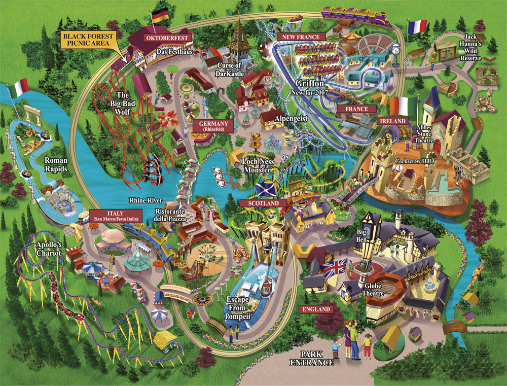
Busch Gardens Williamsburg, 2007
Theme Park Tourist reckons the old map design
pictured above was “inaccurate and
out-of-scale”, when in reality, it is the newer map that is heavily
distorted from reality and that's why it's easier to read. I'm not sure I agree the new one is better overall. Whilst the old style seems too cartoony for a park that took itself as seriously as Busch, it was more exciting. Look how uninteresting Apollo's Chariot looks these days. Most importantly, Busch's maps are single, large sheets of paper. They feel less like a guide or souvenir and more like your dinner placemat to be disposed of.
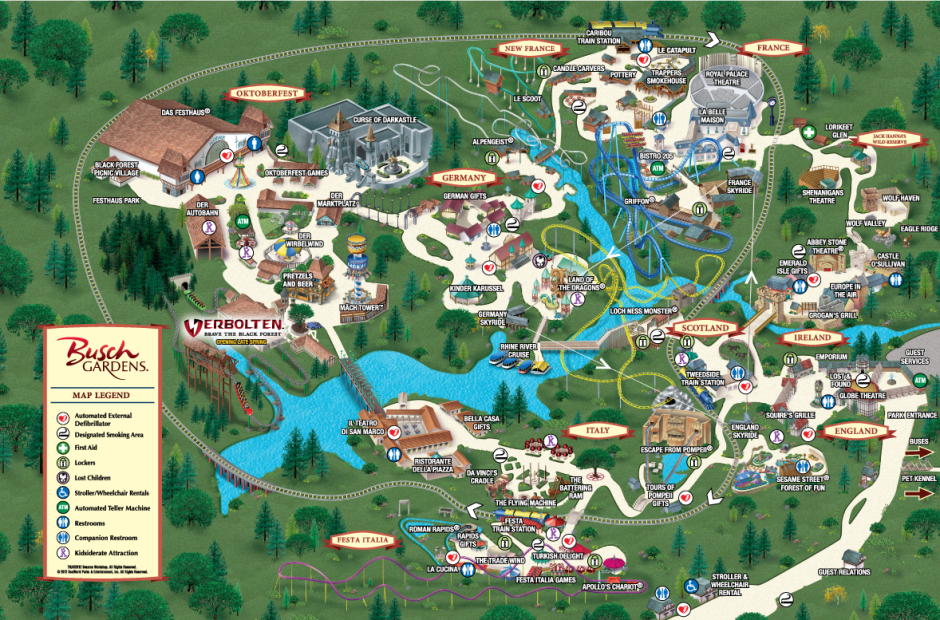
Busch Gardens Williamsburg, 2012
Perhaps my biggest park map pet
peeve is brilliantly illustrated by this awful map...

Liseberg’s miniature map was designed to ensure the park looks as boring as possible, 2014.
Liseberg is not large... Surely if you’re a small park, you’d
want to make the most of the freedom to go crazy with the design without concern of inhibiting navigation…? Draw attention to smaller attractions? Make stuff look
exciting? Be aesthetically interesting? Draw attention to food and shopping
outlets? Instead, we have a practical looking map, but it's soooo small and the sea of
circles and numbers with the key as large as the map itself makes understanding
it impossible! The numbers are all placed on top of
the visual representation of the ride instead of by their queue entrances, many
of the circles obscure rides almost entirely, many attractions are not easily
visible due to the small scale or being indoors, etc. The key offers nothing
but the name of the attraction, which is great if you know what each thing is,
but the entire point is that we don’t know. If you think about it, to any map-reader
it’s irrelevant what an attraction is even called unless you’re specifically
looking for it and already know it’s name, which is great if you're a park that has managed to create distinctive and well known branded attractions, but even they will have some that are not well known. So they need descriptions of some sort, and yet few parks provide any
info about the experience to be had. The map should serve as an advertisement to those lesser-known
attractions. Height restrictions are listed on a separate page completely
(why?) that fails to note the number on the map (WHY?) causing cross-referencing
between multiple pages. No one is going to bother and even if they do, it’ll cut
into valuable time they could just be exploring the park and, ya know, having fun? Liseberg is not alone. In fact, most of Disney's parks in this style category, all the more so following a recent awful design change that Theme Park Tourist explain in their article.
Another style that's all too common and all too horrible is the slightly-cartoony-bland-3D-computer-graphics map, commonly used by smaller amusement parks, but a couple of higher profile examples that should be ashamed of themselves are featured below...


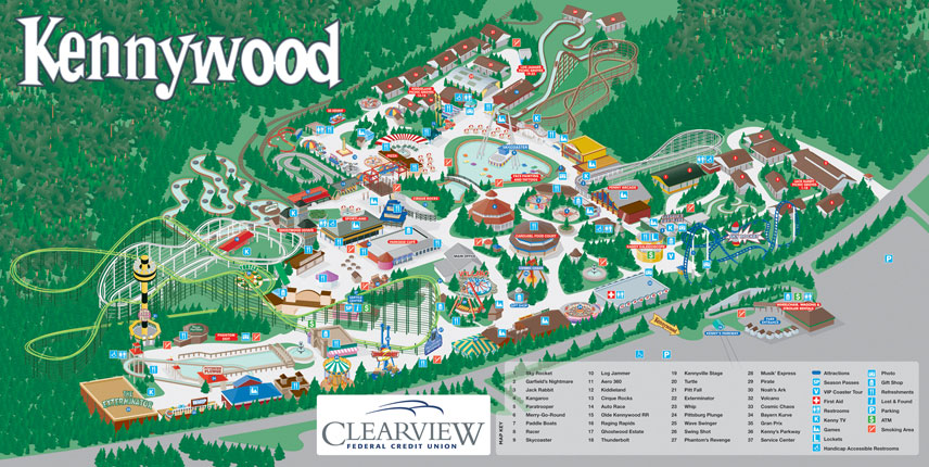
Another style that's all too common and all too horrible is the slightly-cartoony-bland-3D-computer-graphics map, commonly used by smaller amusement parks, but a couple of higher profile examples that should be ashamed of themselves are featured below...
Waldameer, 2014
Hersheypark, 2013
Kennywood, 2010
What I hate about these styled maps is they are just so void of personality. Looking at them fails to excite. How anyone could make a park so crowded and exciting as Hershey look so lifeless and empty is beyond me. It's a talent, for sure.

Thorpe Park, 2012
Thorpe Park’s map was heavily criticised for being… Well, vulgar. But I’m part of
a minority who really like it. Thorpe is small enough with simple pathways
to happily exist map free, especially because you can see almost every major attraction from anywhere in the park, but unlike Liseberg they’ve made something
aesthetically interesting. (Interesting. I didn't say it was aesthetically pleasing.) They've heavily
stylised their attractions to represent their individuality and made the place
come alive, filled with guests who help tell the story of each attraction, vomiting and wetting themselves where... appropriate? But if you look, there's a redneck with an alligator by Storm Surge and a conspiracy theorist by Swarm. That's cool. The map conveys the chaos
of Thorpe brilliantly and is exactly what the park was attempting to market itself
as. Theme Park Tourist complain that the clutter makes it difficult to navigate, but I'd argue that if you're struggling to find your way around Thorpe's open landscape, a map won't help you.
In an analysis of Thorpe's map on CoasterForce, Serena Cavalera makes an interesting point "It could be said that the maps depiction of wild, young crowds encourages regressive behaviour – reassuring visitors that it’s ok to act like a child for the day within the confined of the group." I'd go even further than that and question whether it makes vulgarity and disrespect for the park acceptable to guests? I’ve felt for a long time that Thorpe’s brash personality was getting a bit
out of hand and their recent 360 to marketing themselves as a family park once more suggests I was right, but that doesn’t change the fact that this map was
successfully communicating what they wanted, or thought they wanted,
at the time. This map remains the most innovative and interesting one I've yet to encounter, pushing the boundary of it's purpose as more than a navigational tool or guide book, but rather an illustration of Thorpe's persona and that of all it's attractions.

Thorpe Park, 2014
The new map for 2014 is
praised by Theme Park Tourist, but I’m not a fan. It implies that other than
Thorpe’s coasters, there’s not really anything to do there. And that’s weird, because all
the recent marketing is geared towards rekindling family interest in Thorpe. It still doesn’t mark toilets clearly and their positions are actually
inaccurate. I find the map bland. It makes the coasters look heavily futuristic
and stylised, unthemed and samey. It also fails to really ignite interest in the
brand new Angry Birds land. There’s so much blank space. It looks so small! It seems
to me like everyone let personal distaste towards Thorpe’s old target
audience get in the way of critical analysis and they’re just glad to see it
gone.
Alton Towers is well known for it's complex layout. At around 800 acres, it is the largest theme park in the world, and it's been brewing a sprawling mess of pathways, foliage, architecture and attractions for well over a century. It's no surprise then that Alton's guests have trouble navigating the place and so extremes have been explored attempting to solve that "problem." Cue a unique and highly stylised map style that lasted a a few seasons and reduced Alton to the bare essentials...

The problem with this is that it is so fundamentally out of character. Anyone who's been to Alton knows how that weird gothic magic feels... It feels like damp, dark woodlands and strange abandoned spaces, not phone Apps for kids. The absolute rejection of Alton's personality is one thing, but the way in which this map reduces the park to so few attractions is another. It's reminiscent of faux naive illustration that's trying to be innovative simply by rejecting a history of of knowledge and understanding. It's not that the style is ugly by default, it's a unique map and a piece referencing popular illustration like that of Eboy at the time, it's just not appropriate for Alton Towers.
Alton Towers is well known for it's complex layout. At around 800 acres, it is the largest theme park in the world, and it's been brewing a sprawling mess of pathways, foliage, architecture and attractions for well over a century. It's no surprise then that Alton's guests have trouble navigating the place and so extremes have been explored attempting to solve that "problem." Cue a unique and highly stylised map style that lasted a a few seasons and reduced Alton to the bare essentials...
The problem with this is that it is so fundamentally out of character. Anyone who's been to Alton knows how that weird gothic magic feels... It feels like damp, dark woodlands and strange abandoned spaces, not phone Apps for kids. The absolute rejection of Alton's personality is one thing, but the way in which this map reduces the park to so few attractions is another. It's reminiscent of faux naive illustration that's trying to be innovative simply by rejecting a history of of knowledge and understanding. It's not that the style is ugly by default, it's a unique map and a piece referencing popular illustration like that of Eboy at the time, it's just not appropriate for Alton Towers.
It is my opinion that there was no problem to be solved in the first place and that guests will get "lost" at Alton Towers no matter what map design they're provided with - firstly because most of them won't even have a map, secondly because most people are too stubborn and impatient to use one and thirdly because it is a vast space with a maze of paths. Though I would argue that with so few visual cues, it would be hard to locate yourself on this map unless by a large roller coaster or the towers. To the maps credit, the coasters are portrayed like stylised versions of their recognisable selves. All guests want is a rough idea of the general direction to head and this map does serve that purpose. The lack of obvious themed lands, descriptions (even visual ones, like a cut out that shows inside Toyland Tours for example and so explains what the attraction does) or even attention drawn to smaller attractions, is where this map falls flat. The printed version tries to be quirky by listing toilets as WC and not with the classic toilet man and woman. Flip the map over and the rides list is the most uninspiring thing I've ever seen in my life.

Alton Towers, 2005 reverse. Don't have too much fun now will you?
In 2008, Alton changed their map back to a more realistic style that captured a bit more of the park's personality. The map is busy, but only because Alton is busy, whilst trying to give the eye a break with the most un-British of blue skies and green fields. The key colour code attractions by experience type for targeting at various audiences. Flip the large, beautiful map over and there is a wealth of info on each attraction, explaining what the experience entails and it's height restriction, all colour coded and categorised to match the front of the map. Fantastic! The layout is reasonably accurate and enhances some smaller attractions into significance and even where it doesn't, the breakdown on the back does the job. The map is not obscured or obstructed by any of the signage or lists or keys and something really important is how the layout is distorted. In Ug Land, for example, Corkscrew was actually visible up the entrance end of the land, to the right of Rita, but it's entrance was waaaaay down the back, past Rita's. The map does a brilliant job of showing that. My only criticism is the lack of branded logos, but that can go horribly wrong, as seen in this disastrous monstrosity from Paulton's Park in 2011. The other great thing about Alton's 2008 map is there really is very little in the way of advertisements on the back, which is rare. It comes across as high quality and not... desperate? Six Flags have some nice maps, but the comparative smallness of the map itself on the huge folding out sea of money-grabbing garish adverts just makes me frustrated. It's hard to find the information required. I don't mind some ads, for example in Chessington's 2014 map there's a tonne of on brand, relevant ads on the back for the hotel, restaurants and various add on experiences that come across as informative and useful. Alton's 2008 map really is a wonderful souvenir piece that is both informative, on brand and inspiring to guests.

Alton Towers, 2008
In 2011, Alton changed their map again. They made it 20% larger, allowing for more space on the reverse. And with that space they decided to list attractions by area instead of audience/experience, which provides the added benefit of being able to see what food outlets are nearby to your current location. It removes the ability to seek out attractions specifically for your needs, but like I suggested before, I'm not sure people do that.

Alton Towers, 2012
I love this map. It is such a beautiful and immersive thing that really captures what Alton feels like and illustrates the attractions, their individual brands, atmospheres and audiences whilst unifying itself stylistically. It's an assault to look at, full of excitement like Thorpe's 2012 example. It's full of flaws, of course. Distorted, but in ways that won't benefit navigation and some attractions don't stand out because they simply cannot compete. I think the previous design is probably way more practical, but this thing is a work of art. It's biggest flaw is how close Air and Thirteen/Rita appear, because the valley is in fact incredibly wide and has no direct path across it, other than the Skyride. In fact, I wonder if this map encourages exploration of the gardens and valley and whether that leads to irritated or enriched guests? Perhaps amusingly, the new map is now a weird hybrid between these two previous styles and depicts the valley as black unappealing abyss. What these designs say to me though is that Alton now understands that it can never prevent it's guests getting lost and that the map is there to serve other purposes that enhance the day. An illustration as wonderful as this implies a high-end experience. The 2012 map is the only Alton map I've ever seen used in brochures and pamphlets outside the park at service stations and the like, demonstrating it's advertising power as a portrayal of the excitement to be had within the park.
Another map Theme Park Tourist highlighted was Phantasiland's, who used to have an unusual and beautiful, but I agree - completely useless - map that resembled conceptual art more than it did a usable map. The peculiar sketch seemingly drawn in real media fails to show much at all. They key also provides no information of value other than the attraction name and has a strange way of listing height restrictions. Each attraction in the list has M1, M2, M3, etc. which there is yet another key for explaining what each of those mean. "M1: not under 1.00m, M2: Not recommended for under 1.00m..." Ok? Why not just say that next to the name of the ride?

Phantasialand, 2008
Phantasialand is a park made up of narrow streets and tall themed facades. It is, I would argue, the world's most intense themed environment. I've always wondered how a park like this would cope on a very busy day, because the park itself doesn't feel very large. A very literal, practical map is kind of required with Phantasialand's network of streets and quirky attractions. Their new map is... Brilliant. I first encountered it when I stumbled upon the artist's website. What's special about it is that despite being a top-down, literal representation, it's surprisingly full of character. The attractions are accurately depicted and exquisitely detailed. Attempt has been made to visually describe the less obvious, indoor attractions with cut outs that allow us to instantly understand that Temple of the Nighthawk, for example, is a roller coaster, yet Mystery Castle remains a mystery! The attraction list is organised by area, colour coded and descriptive! And what's more, the numbered icons are placed at the attraction entrances, not ambiguously hovering above the ride's picture! The impressive attention to detail even goes as far to shade queue lines that aren't main pathways in pink. Flip the map over to find height restrictions, which are, to be honest, a little over-complicated and unnecessarily exempt from the main list, but at least they're coded and numbered to match the front of the map. I find the orientation and lack of attention drawn to the entrances a bit odd, but perhaps that is to cater to there being 2 of them?

Phantasialand, 2014
When I visited Phantasialand, I could have really done with a map like this that offered little descriptions of each attraction and eatery. It further demonstrates in style that there is no right or wrong, but that each park has individual problems, requirements and personality that has to be considered and represented in a practical yet exciting way that encourages guests to explore.
Both Efteling and Tokyo Disneyland have similar, detailed attractions lists to Phantasia's newer map, whilst Tokyo DisneySea has a wonderfully unique illustrative style that bares similarity to the old Phantasialand "concept art" map, conveying the park's style and sense of discovery. Unfortunately, it also fails to make it look like there are any attractions at the park and has changed since.

Tokyo DisneySea, 2009
Staying in Asia, Happy Valley has an interesting map that combines 3D, drawn and photographic elements together. The use of photo-manipulation to represent certain complicated structures would presumably help guests locate themselves and it too has a detailed attraction list, explaining what each ride is about.
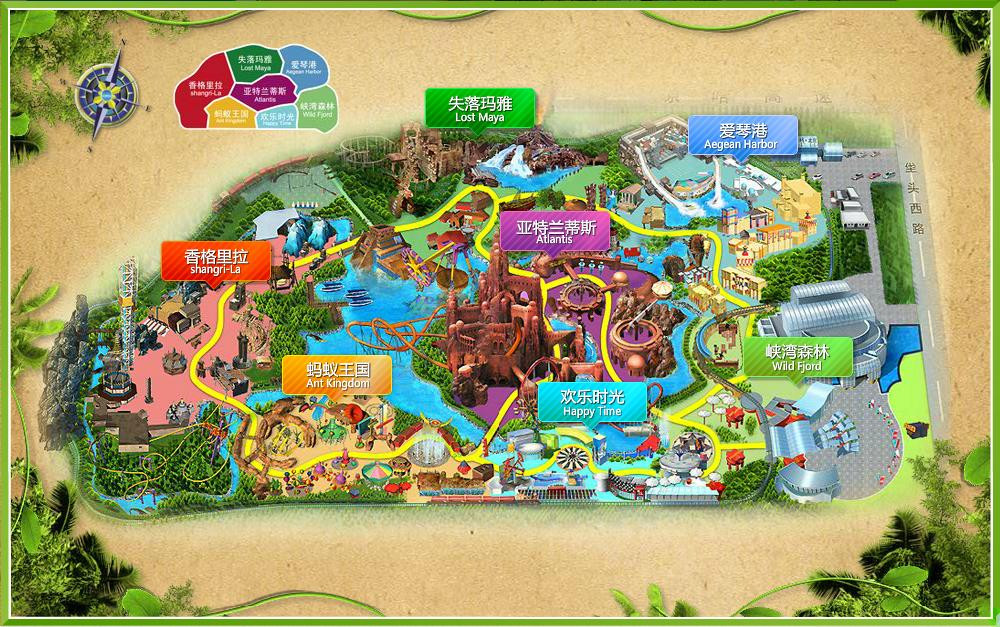
Happy Valley
The weird thing about this map is the yellow pathway. Perhaps if I could read the text I could make more sense of it, but is it there to show the general layout and major navigation route around the park, hoping to stop guests from getting lost in park's pockets when they only wanted to pass through?
My favourite map is arguably really boring. It belongs to Cedar Point.

Cedar Point, 2010
All Cedar Fair parks use this aesthetic and an argument can (and of course will) be made about how that fails to acknowledge each park's history and unique flavour. And that's why I've picked The Point's specifically, because this map looks like Cedar Point feels. Amusement parks feel like slightly washed out but none-the-less bold seas of tacky colours. With somewhat whacky coaster track that doesn't take itself too seriously. The map describes the things that really matter - food and retail, but simply names rides and other attractions and the height guide is separated entirely. Cedar Point, and it's collection of coasters, are a brand that is encapsulated within this map design, and the fact they sell their map in poster form only enhances my appreciation of it. The choice to not describe their rides comes across as a bold demonstration that they don't need to. That their attractions have distinct personalities understood by their guests.
I've been to parks that lack maps entirely, perhaps the largest of which is Hansa Park. I've also witnessed Chessington start charging for maps in the past, presumably trying to eradicate their ephemeral and disposable nature. Maps are not necessary, and they are not used by the majority of guests, but what they are is a convention of a theme park visit. An expected - free - souvenir. They can help to define the brands (the rides and their themes) in a park by giving them illustrative content. My love for theme parks truly began after my first visit to Alton Towers in 2000 and the map was a huge part of forming a fascination with the attractions and the environment they reside in, as it was a piece of Alton Towers to physically connect with away from the park. That's why ephemera is special - this tactile thing that usually gets thrown away, but represents memories of a fleeting event. The best maps are those that both stylistically match the atmosphere and brand of the park they represent, and successfully provide visual and written information about the many attractions and facilities within.
Navigation is not their primary purpose.
No comments:
Post a Comment